Accordion Block
The Accordions Block allows users to create collapsible content sections. This block commonly used for FAQs, feature lists, and structured content
Features
Fully customizable styling
Expand/collapse functionality
Multiple accordions in a single block
Option to keep one or multiple items open
Smooth animation effects
Compatible with all themes
Mobile-responsive
Block toolbar
Each block has its own block-specific controls that allow you to manipulate the block right in the editor. If you hover over the buttons, tooltips will tell you what is behind the buttons, and also show you keyboard shortcuts when available.
The block toolbar for the accordion block shows these buttons:
Transform to
Block-moving tools
Change alignment
Change text alignment
Bold and Italics
Insert links
More rich text controls
Options
Transform to
The Transform to button lets you convert the Accordion block into Columns, Details, and Group.
Block-moving tools
Use the block-moving tools to move the Accordion block.
The drag or six dots icon allows you to freely reposition the block anywhere within the editor by holding the icon and dragging it to the new location.
You can also use the arrow icons to move the block up or down within the group of nested blocks or when there are multiple blocks.
Change text alignment
Block toolbar with the drop-down for alignment.
Use the Change text alignment tool to modify the alignment of the Accordion block. Select the icon to display the alignment dropdown menu. You can align the text to the left, make it center-aligned, or orient it to the right.
Bold and italics
The Bold and Italics formatting options are used to customize the text in the Accordion block. You can also use keyboard shortcuts to enable these text formatting:
Ctrl + B or Command + B to bold the text.
Ctrl + I or Command + I to italicize the text.
Insert links
The Insert links tool lets you add a hyperlink to the selected text.
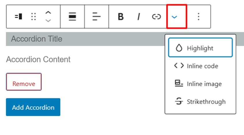
More rich text options
Examples of the location of the “Rich Text Editing” menu in an Accordion block.
The drop-down menu to the left of the More options menu contains a range of additional rich text editing options such as highlighting, inline code, strikethrough, and more.
More options
Example of the location of the “More Options” menu in an Accordion block.
The More Options menu represented by three vertical dots on the far right of the toolbar gives you more features such as the ability to duplicate, remove, or edit your block as HTML.
Block Setting
WordPress blocks have specific configuration options in the block settings panel. To access the Accordion block settings panel, click the Settings button at the top-right corner of the editor. Here is a list of the Accordion block settings options:
Title Color settings
You can set block title text color and background color by this setting.
Content Color settings
You can set block content text color and background color by this setting.
Typography
The Typography settings enable you to customize the font and text appearance of the content within the Accordion block. The settings have various options, such as font size, font style, font family, and letter spacing.
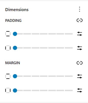
Dimensions
The accordion block provides various options to adjust its dimensions, such as width and height, allowing you to customize the text layout to ensure visual consistency.
Advanced
The Advanced tab lets you add CSS class(es) to your block.
The Advanced settings let you add CSS class(es) to the Group block.
The Additional CSS class(es) enables you to write custom CSS class(es) to the Group block, so you can style the block as you see fit.


